Friday, 2 September 2011

Task 2

Dr pepper - cherry
I chose this advert because its completely different to the other, and although choosing an advert similar would probably be easier I wanted to explore a different genre and advert for an older target audience to broaden my idea for my own product.
This advert features singer celebrity fergie, from the black eyed peas. By choosing a well known artist you immediately have your target audience, men who find her attractive and woman who like her music.  The advert is very simple and seductive and uses fergie to sell the product in a provocative way.
In the advert fergie walks onto the set in a long revealing robe picks up the Dr pepper can and pours it into her mouth (unexpectedly) there is no speech until the very end of the advert, the opposite to the Vimto advert where their limited speech is at the beginning. They also don’t reveal the product until half way through, making you watch more carefully to see what it’s for. This is a good technique to think about using when creating my own advert because I think its affective, the first time I watched the advert I was anticipating to see what it was for, which made me keep watching it.
I would say this advert was targeted at males and females aged 18-30, a much broader audience than the Vimto advert. Fergie is wearing quite a revealing outfit, in black maybe suggesting she’s older, more mature and sexy. The colours are kept to a minimum much like the design of the set, silver, black and red. This helps emphasise the sex appeal in the video, with the red lipstick and dark make up.
The adverts pace is quite slow throughout, there is only 15 cuts throughout the whole advert which is considerably less than in the Vimto advert which is a lot more energetic.  They use some extreme close ups in the advert when showing the can, emphasising the brand and product, this is effective and adds detail without using slow motion.
The music begins slow and speeds up interestingly at the slowest part of the action in the advert. The music is a mix of pop and rap. It’s fitting with the advert, although its quite contrasting with the imagery of a classy lady and rap music, but that’s the idea of the advert, coca cola – with a twist!
I enjoy the advert I think it works well, I like the close ups and from watching this advert feel they’re defiantly a must in an advert when advertising your brand or something new.

Tv advert production Task 2

Analyse in detail 2 fizzy drinks
Vimto
this is the advert I’ve decided to analyse, I choice this advert because I think its aimed at a similar target audience to what my own product will be, therefore should hopefully help me when developing and creating my own advert.
The advert starts with music straight away, upbeat, and catchy and helps set the scene for the first 3 seconds. This time helps you take in all the information given to you and is a great way to set the scene and introduce the characters. In this particular advert the characters consist of three fruit cartoons, a raspberry, a grape and an apple.  The music and image of the fruits, together creates a light hearted and humorous atmosphere, ready for the speech to start. There isn’t a lot of talking in the advert, I don’t think there needed to be as the imagery, cinematography and music do the talking. The only words are said by the computerised raspberry right at the beginning, other than this there’s only music, sound effects and the action onscreen itself to keep the advert flowing. For this to work, each component that makes up the advert must be clear so the viewers can easily understand what’s happening.  I think adverts with less; even no words have the potential to be the most powerful. The accents of the fruit are very distinctive and are popularly used in other recent films of a comedy genre, “Helloooo pretty ladysss”  says the Russian raspberry, by choosing an accent like this emphasises the comedy in the advert even more, all these factors make the characters funny to many audiences. The music used is their rap song ‘bounce and boom’ by big babby ft box bottom.
The characters consist of 3 computerized fruit and three young attractive girls who appear to be stuck up at first and not interested in the fruit because they think they’re too good for them, (a realistic situation in life)  until they show off, the car starts bouncing, the fruits then burst, thus creating the Vimto. The girls then taste the Vimto and are more than impressed, their attitude changes from boring to fun after tasting the soft drink! The girls are wearing light coloured tops that don’t stand out therefore not taking much attention away from the brightly coloured fruit. Similar to the scenery around the cars and the cars themselves everything seems very ordinary and nothing other than the fruit pops out at you. The girl’s car is also white suggesting that the girls are innocent young girls. The fruit are represented as ‘typical cheeky lads’ the producers chose the up beat hip hop music and American gangster car for comical value.
I think the target audience for Vimto is youths around the age range of 12-20, who are buying a fun flavoursome drink. I think the girls appearance and music chosen helps to aim the advertisement at the intended target audience. I think the advert could be aimed at boys and girls but I think more towards boys because its all about fun, something new and its funny. I believe these 3 factors link me to a boys audience.
The product isn’t actually revealed until the very end, this can go one of two ways, be effecting IF you keep your audience to the end of the advert to see what it is for, or bad, if you waste a whole advert because the viewers turn over after only a quarter way through so I think if your going to do this you need to have a very exciting advert to keep the viewers attention. I think this advert is an excellent example of this technique of advertising being used to its best.
The genre is definitely comedy, it uses computerised fruit to represent humans in a funny way with accents, I think the audience will enjoy this humour. A drink like Vimto wouldn’t suit any other genre unless the drink was completely re invented as something different with a different logo and design. Vimto It is a fun and fruity drink, so needs to have an advertisement that’s full of action too. it wouldn’t advertise the drink to the right audience, or suit the taste if not.
The director and editors have cleverly cut the shots to the beat of the music. This is affective and helps relate the music to the advert even more. There’s Always 3 people in shot at all times, this helps creates more action on screen. They give many different views of the characters from different angles and closeness; this adds depth to the advert and make it more interesting to watch.
I really enjoy this advert myself, I think it’s successful and serves its intended purpose, its memorable and gets people talking about it. Its fun, bright, light hearted and entertaining, what more could you want in an advert?!

task 4

After researching soft drinks and from the results of my survey I am now a lot more clear on what it is exactly I want to create. I am going to create an advert aimed at 14-18 year olds, I want to aim my fizzy drink at boys because I feel there is a larger audience for fizzy drinks than girls. I want to create a bright fun full of action advert I think this is fitting for the product and target audience. From my research I found that boys like energy drinks more than just regular fizzy drinks. I’ve decided I want my drink to be in a can, I think that boys prefer cans because they feel more grown up, than holding a bottle.
I want the design of my bottle to be striking and bright with bold lettering a imagery. The music I plan the use will be upbeat and energetic much like my advert itself. The editing with will be snappy and quick I want long shots too extreme close ups. The advert will be cut to the music.
A typical profile for my target audience would be a boy ages 14-18 who enjoys playing outside with mates, having a laugh and chilling out at the skate park or at the park in the sunshine. He likes watching extreme sports on TV like snowboarding and motocross racing. He likes upbeat music, rap, hip-hop. His style is carefree but old school trendy. He wears baggy jeans, vans and converse. His favourite colours are green purple and blue, or red white and blue. They would be fun to be around and have a lot of friends, love to socialise and plays computer games.
I want my advert to be really bright, but I’m still undecided with the colour scheme. I would either like a dark bright purple, green and blue. Or patriotic colours, red white and blue. As I progress further with my idea I will soon know what one will be most effective.
My idea for my advert is set in a skate park on a really sunny day, bright graffiti colours, and a group of friends hanging out practicing their new skills and tricks, all the friends can do the new trick, apart from one. His friends cheer him on but he still can’t get it, one of them then offers him this drink, he downs it all attempts again and gets it spot on. The friends cheer, come together and carry on enjoying their day all together.
I think this idea will work as its energetic, fun, bright and full of action, a real life situation young boys might find themselves in when they feel alone, they can’t do something, peer pressure, or times when you just need a hand. My energy drink will provide this help, it’s about giving you that extra boost and coming together.
My can will be a larger can than the average size, quite tall and wide. I would like the can to have a slight curve in the centre, to make it easier to hold and different to other energy drinks like relentless and red bull.
My slogan will be short catchy and memorable, ‘that extra push’ push being help and also relates to pushing on a skateboard. I’m not set on my slogan I want  to make it more catchy but the basic idea is there.

Research on Quatro!

For my final bit of research I’ve decided to do it on ‘Quatro’ a fizzy drink, no longer around. Quatro was a canned, fruit-flavoured carbonated drink produced from 1982 to 1985 in the United Kingdom. From 1983 to 1985 it was commonly available in the UK, though production and sale of the drink ceased there in the mid 1980s. Green in colour, its name derived from the four fruits used; pineapple, orange, passion fruit and grapefruit. I think by looking at this I can see why it did, and didn’t succeed. Here’s a few adverts and images of the fruity drink…
These adverts are very contrasting to the others I’ve shown you. It’s a lot more action and sci-fi themed. A genre we don’t see much of nowadays in the fizzy drink market, especially sci-fi.  This choice of genre may have been the reason the drink didn’t succeed.  The video  features a man approaching a futuristic machine where he inserts a Quatro card, the machine selects a can for him and goes about dispensing it, however when the machine gets an error the man is about to kick the machine, but the machine stops him, hits itself and corrects the fault. Unfortunately as the drink wasn’t well known and wasn’t around for long I’ve found it hard to get information on it. I think I can learn a lot from the commercials for it though, what not to do maybe? Or could it be what the market today needs once more?!


Vimto research

Vimto commercial I looked at to help with my research

Vimto producers successfully targeted their product by using comedians and celebrity’s to portray their product in the humorous  and fun way in which they wanted.

Vimto is a soft drink originating from the United Kingdom. It was first manufactured as a health tonic in cordial form, then decades later as a carbonated drink. It contains the juice of grapes, raspberries and blackcurrants.
Vimto was created in 1908 in the small village of Timperley in Cheshire, England, by John Noel Nichols a wholesaler of spices and medicines. It was originally sold under the name Vim Tonic, which Nichols shortened to Vimto in 1912. Vimto was originally registered as a health tonic or medicine, which was then re-registered in 1913 as a cordial. 1970, Vimto was launched in the United States, home of twin giants Coca Cola and Pepsi!

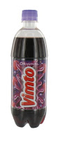


During the 1990s, Vimto print advertisements used the popular character Purple Ronnie, along with slightly rude poems by Giles Andreae, the creator of Purple Ronnie. In 2003, Purple Ronnie was dropped, and a new creative direction was adopted, revolving around the benefits of Shlurpling the Purple. This, in turn, led to the launch in 2006 of Billy and his Dad's Pants - a modern-day morality story in which, despite turning up at the swimming pool with his Dad's pants in the middle of his roll, Billy wins out with ingenuity and humour. The theme tune 'Dad's Pants' become something of a cult classic, and was based on the Loudon Wainwright III song, "Dead Skunk in the Middle of the Road". A sculpture entitled "A Monument to Vimto" (1992), carved out of an oak tree from a sustainable forest by Kerry Morrison, is situated on Granby Row in central Manchester. The sculpture commemorates the fact that Vimto was originally produced on this site.
There have been several major advertising campaigns to promote Vimto.
Dad's Pants - The "Dad's Pants" television commercials featured a school boy who mistakenly took his dad's underwear to a swimming lesson. The song was originally written by comedian John Warburton.  http://www.youtube.com/watch?v=iFmRIaON3-8&feature=related
Purple Ronnie - Purple Ronnie was a crudely-drawn stick figure cartoon character designed by Giles Andreae, although originally created by Jo Dobbs. The figure is now used on greetings cards. http://www.youtube.com/watch?v=Rs7AVoHRN3A
Shlurple the Purple These advertisements, aired in 2005 featured a person drinking Vimto to find a strange thing happens to them .http://www.youtube.com/watch?v=5nNMquY00c4
Seriously Mixed Up Fruit -Seriously Mixed Up Fruit is the new strapline for Vimto and replaced Shlurple the Purple in 2009. This campaign features anthropomorphised raspberry, grape and blackcurrant characters engaging in various activities which inevitably ends up with them being 'splatted', thus becoming the drink.
4th may 2010
“Vimto is about to burst into homes this summer with a fully integrated nationwide advertising campaign on TV, radio and online. From the beginning of May , Vimto will launch its ‘Seriously Mixed Up Fruit’ advertising campaign on national TV and online during internet replays of popular programmes that appeal to the brand’s teen target audience, including Hollyoaks, Glee and Big Brother. This is complemented by a nationwide radio campaign which features a new advert for Cherry Vimto and introduces the brand’s new cherry twin characters – Les Cherries – for the first time. Cherry Vimto will also be sponsoring the ‘The Big Top 40′, the national music chart show that is syndicated to 145 different commercial stations reaching over 2million teenage listeners across the UK.

Creating awareness with the brand’s teenage audience will be maximised by a Cherry Vimto sampling programme taking place in under-18s club nights throughout the year. There will also be a digital programme which includes the release of new branded ‘advergames’ and social media content to appeal to young consumers. Vimto’s Senior Brand Manager, Emma Hunt, said: “Vimto has had a fantastic year, growing by +28%. To ensure this continues we’re increasing our marketing investment by 20% to drive awareness and trial of Vimto and new Cherry Vimto over the crucial summer trading period.
“Our strong multimedia programme will ensure we reach our target teen audience across the UK and this together with the brand’s excellent growth this year should give retailers the confidence to stock the Vimto range.”

Vimto has developed its fun and quirky identity since its very first televised commercial in 1956 and, over the years, it has tickled the nation through its campaigns with a little help from well known celebrities of their time including Derek Griffiths, the Roly Polys, John Peel, Angus Deayton and Matt Lucas. Aimed to be energetic, young hearted and family orientated, the adverts have featured funny scenarios, catchy tunes and memorable slogans. Distinct characters created to help consumers identify with the brand have included Max the British Bulldog in the 1980s and cheeky Purple Ronnie from the 1990s as well as today’s schoolboy ‘Billy’. A campaign introduced in 2005 introduced the phrase’ Shlurple the Purple’, which is still used today as the official Vimto slogan.  I think this slogan works well as its simple, different and remembered.


Logo


The Coca-Cola logo, like the product itself, is rated among the most recognized logo design and brands in the world. The typeface used, known as Spenserian script, was developed in the mid 19th century and was the dominant form of formal handwriting in the United States during that period. The logo itself has adapted slightly over recent years.
1887-1890s – Inserting the ‘Trademark’
These two important little words were added to the tail of the first ‘C’

1890-1891 – Extra swirls
For just one year, our logo changed its appearance quite dramatically with this extra swirly script. Afterwards, the logo returned to its previous font.

1941-1960s – Tail tweaked
In this version, the words ‘Trademark Registered’ moved out of the tail of the ‘C’.

1958-1960s – A fishy shape
This period saw the introduction of the Arciform or ‘fishtail’ logo.

1969 – That famous white wave
The Arden Square logo was unveiled to the world. In this red box, the familiar Coca-Cola script was underlined with the iconic white ‘wave’ known as the ‘Dynamic Ribbon Device’, which is still used to this day.

2003 – Keeping it real
With the introduction of the ‘Coca-Cola... Real’ campaign, the logo’s ‘white wave’ was enhanced with a shock of yellow and some floating bubbles.

2007 – A classic design A simple, yet bold, design with a single white ribbon.


2011 – 125 years of happiness
Coca-Cola's 125th birthday logo sees bubbles bursting from our famous contour bottle – a celebration of our past, present and future.


The brand's colour, the now familiar Coca-Cola red, remains a highly important component of this design classic. White cursive text sat on a bright red background has since been used for almost all of Coca-Cola's rival brands (with the notable exception of Pepsi)
Shape of the Coca-Cola logo:
The Coca-Cola logo comes in a rectangular shape or a circular shape with the hobble-skirt bottle on top. The rectangular design is a fairly simple one with a cursive font and the swirl.
Color of the Coca-cola logo:
The only two colors used in the Coca-Cola logo are red and white, both appearing vibrant nevertheless simple in design as well as tempting the youth minds. The fonts are written in white with an energetic red background.

Target Audience?
In my opinion the target market of coca cola is youths aged between 15-25, yet also reaches 40 plus, as they serve this age group with diet coke and coke zero. I don’t think they specifically target a certain gender but I believe both genders like and use it. I think they target their product to people with busy lifestyles, with shortage of time. The age range targeted is linked to students and family oriented people. Upper lower class and lower class people. They like technology and the media, are into texting, music, watching TV and enjoy TV adverts. I think coca cola always try and encourage being active, through sports and fitness too, most of their adverts are linked to sporting events, Recently involved with the Olympic games 2012, their involved in finding torch holders around the U.K. previously coca cola launched the FIFA world cup. Coca-Cola has been an official of sponsor of the Fifa World Cup since 1978 and an in-stadia advertiser since 1950. I believe in more recent years coca cola’s had to reinvent itself with a more healthier approach, with obesity on the increase and more people conscious of their weight they need to advertise their product in a more active youthful way, their target audience being young people. You can see straight away from the advert I have looked at above that the ‘open happiness’ campaign represents active people having fun enjoying themselves keeping fit and refreshed with coca cola.
Slogans over the years
1886-Cola-Delicious, Refreshing, Exhilarating
1886-Drink Coca-Cola
1904-Delicious and Refreshing
1908-Good To The Last Drop
1922-Thirst Knows No Season
1926-Stop At The Red Sign
1929-The Pause That Refreshes
1952-What You Want Is A Coke
1954-For People On The Go
1955-Americans Prefer Taste
1957-Sign of Good Taste
1960-Relax With A Coke, Revive With A Coke
1963-Things Go Better With Coke
1975-Look Up America
2000-Enjoy
 2001-Life tastes good
 2003-Real
2006-The Coke Side of Life
 2007-Live on the Coke Side of Life
 2009-Open Happiness
 2011-Life Begins Here "Always Coca-Cola"

Advertising and market strategies -Price
The price of coke is very competitive with other leading brands, you could buy:
Can of coke (330ml) - 59p
500ml bottle -£1.08
2L bottle - £1.78
Coca cola sells cheapest in ASDA supermarkets over TESCO and Sainsbury’s.
Coca cola uses above the line promotion, this is on TV, in the cinema, on the radio, in newspapers, magazines, posters and billboards. They advertise on a huge scale all around the world. Coca cola’s biggest promotion is probably through sponsorship, working alongside advertising like the FIFA world cup. To be involved in such a huge world wide event gets lots of attention from all over the world.  And is an excellent opportunity to advertise your product to a huge audience. I think coca cola uses advertising techniques such as ‘emotional selling points’ in some of their campaigns, one excellent example of this is shown in the coca cola FIFA world cup launch ad, in this add shows clips music, and memories created all over the world that everyone will have at least one emotional link to, it helps the audience to embrace the product and make a stronger connection to it. Emmanuel Seuge, the group director of worldwide sports and entertainment marketing at Coca-Cola, said the campaign is the single largest marketing push the soft drink giant has ever run.